Colors have always played an essential role in design and art. But how do artists and designers determine the perfect color combinations that are visually appealing too?
The answer lies in color theory – the study of how colors harmonize and the relationships between them.
Let’s explore the fundamentals of color theory and the various color schemes that can elevate your designs to new heights.
What is Color Theory?
Color theory is the study of how colors mix, match, and interact with one another. At its core is the color wheel – a circular arrangement that visually organizes hues and shows their relationships. Primary colors (red, blue, yellow) sit opposite their secondary hues (green, orange, purple) at 180 degrees.
Understanding the color wheel allows designers to create harmonious color schemes and palettes based on prescribed combinations and patterns. Complementary colors, for example, are pairs that sit directly across from each other, providing maximum contrast.
In digital design, colors are defined numerically using models like RGB, HEX, HSV, and HSL. Selecting hues from these models and combining them based on color theory principles produces intentional, visually appealing palettes. A monochromatic scheme, for instance, uses tints and shades from a single base color – Ideal for elegant, sophisticated branding.
Effectively applying color theory involves understanding not just the technical color models, but the emotive properties of different hue combinations. Mastering these concepts allows you to make informed color choices to evoke specific moods and styling effects. Here are some color schemes that are widely used.
Analogous
An analogous color scheme uses three colors that are side-by-side on the color wheel. One main color is selected, then the two colors immediately next to it – one 30 degrees clockwise and one 30 degrees counterclockwise – are used to create a harmonious, related palette.
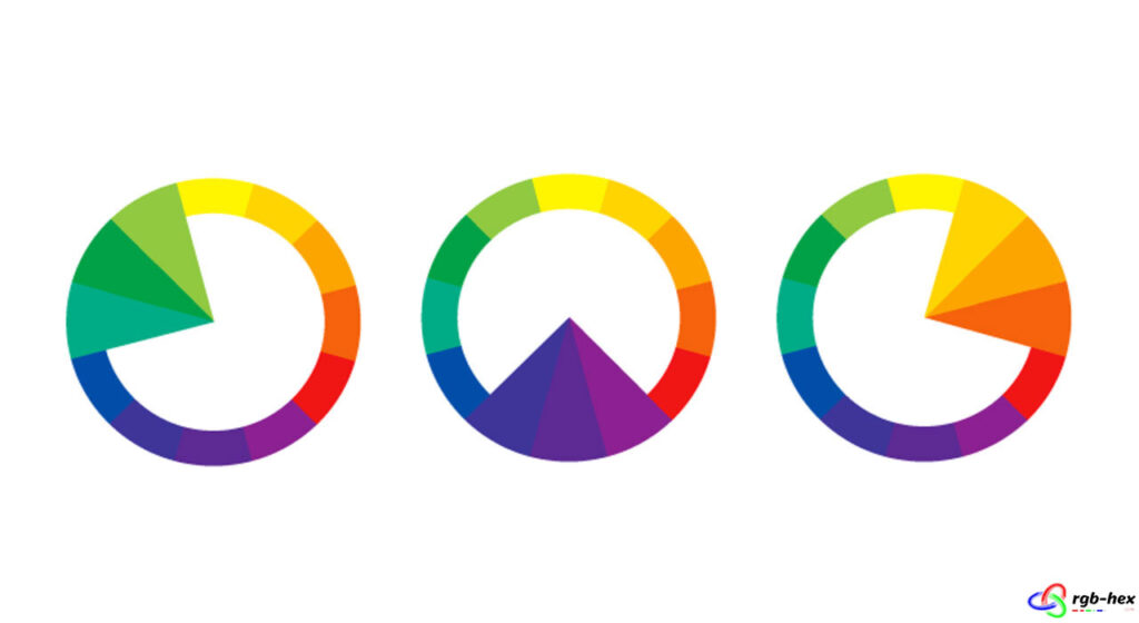
Analogous schemes are often found in nature and can create a sense of peacefulness and calm. They are popular choices for interior design, fashion, and branding aimed at a softer, more subdued aesthetic. Analogous palettes can be particularly effective for creating a desired mood or atmosphere.
Monochromatic
A monochromatic color scheme uses different tints, shades, and tones derived from a single base hue. This approach creates a cohesive and harmonious look that is subtle and conservative.
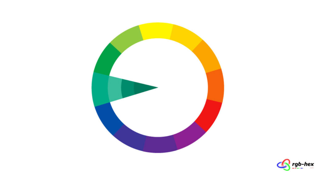
Monochromatic color schemes are frequently used in minimalist design, luxury branding, and sophisticated interior spaces, where a sense of elegance is desired. They can also be effective in creating a calming atmosphere, as the use of a single hue is less visually stimulating.
In fashion and product design, monochromatic colors convey refinement and simplicity. However, care must be taken to incorporate enough tonal contrast to prevent the palette from appearing flat or dull.
Triadic
A triadic color scheme uses three colors that are evenly spaced around the color wheel at 120-degree intervals. This creates a high-contrast yet balanced combination that can produce vibrant, bold color palettes.
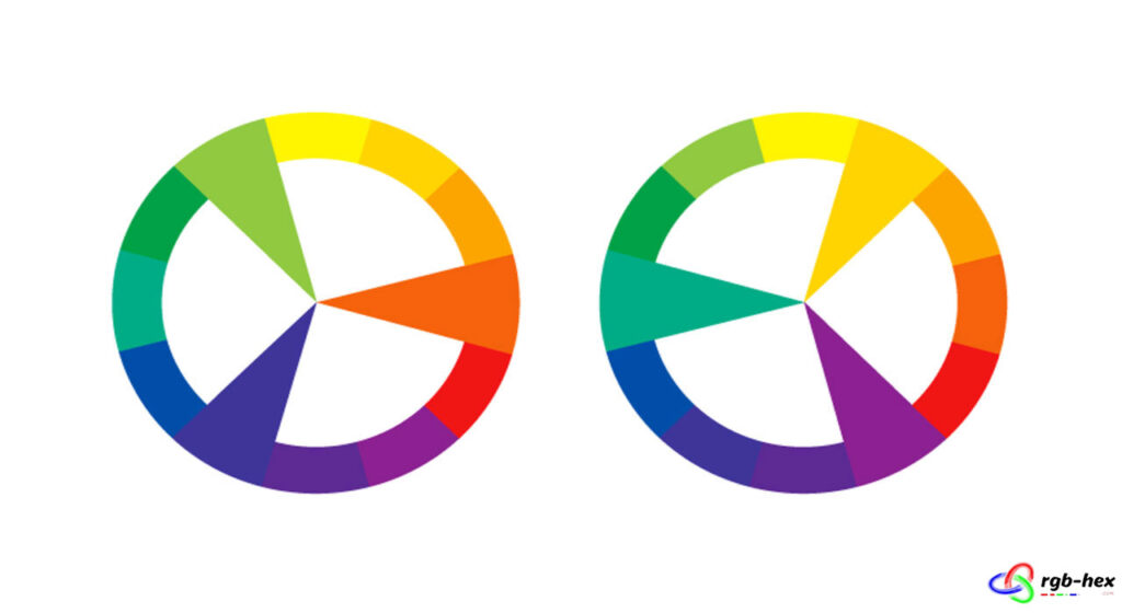
Triadic color schemes are often used in branding, product design, and advertising, where a bold and attention-grabbing color palette is desired. They can also be effectively used in interior design, fashion, and art.
However, it’s important to carefully balance the three colors, as an equal distribution can be overwhelming. Often, one color is used as the dominant hue, with the other two playing supporting roles.
Complementary
Complementary colors are pairs of colors that sit directly opposite to each other on the color wheel. These color combinations provide high contrast and create a vibrant, eye-catching look. When used together, they make each other appear brighter and more prominent at exactly 180 degrees.
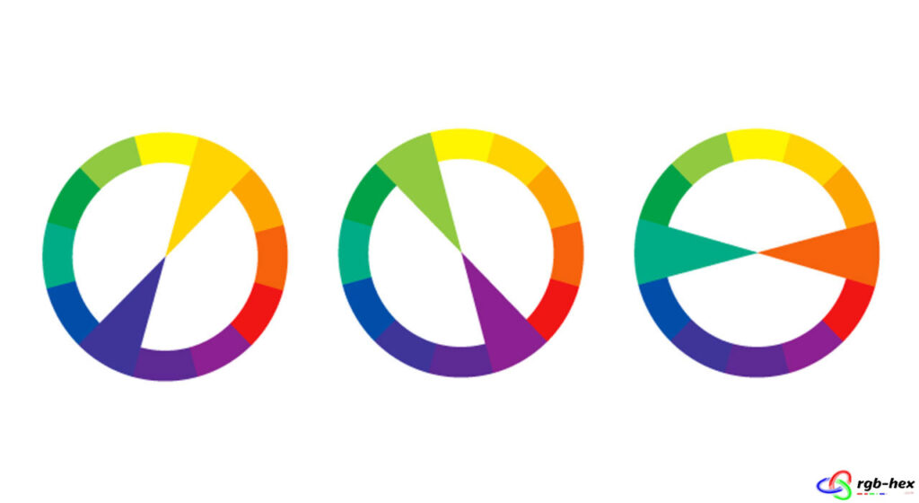
Complementary colors are often used in branding, advertising, and product packaging to grab attention and create a bold, energetic look. However, they need to be carefully balanced, as too much contrast can be overwhelming. Typically, one color is used as the dominant hue, with its complement played as an accent.
Tetradic
A tetradic or rectangle color scheme consists of four colors that are evenly spaced around the color wheel. Two of these hues are complementary colors directly across from each other at 180 degrees, with the remaining two sitting at 90-degree angles. This creates a double complementary color relationship.
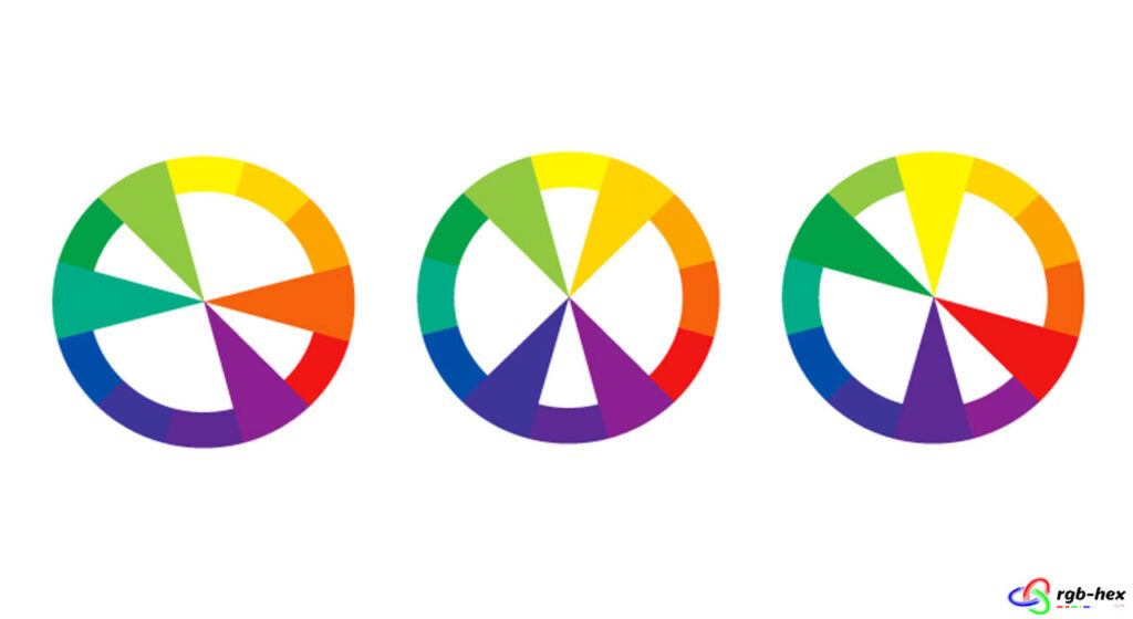
Tetradic palettes can be quite vibrant and high-contrast. They are often used in bold, modern designs where a strong visual impact is desired, such as branding, advertising, product design, and graphic art. However, care must be taken to balance the colors appropriately to avoid overwhelming the viewer.